4.1. Enrollment Activity#
How many learners are enrolled in my course? Enrollment activity data helps you monitor how many people are enrolling in your course and how that number changes over time.
Enrollment activity data is updated every day to include changes in enrollment through the end of the previous day (23:59 UTC).
4.1.1. Gaining Insight into Course Enrollment#
EdX Insights delivers enrollment activity data in a chart, a set of metrics, and a report that you can view or download. Descriptions follow; for detailed information about the computations, see Computation Reference.
4.1.1.1. Daily Learner Enrollment Chart#
The daily learner enrollment chart is a stacked area chart: the filled area represents the number of learners enrolled in the course on a particular date. For courses that offer more than one enrollment option or track, different colors represent the number of learners who were enrolled with each option.
The chart includes each of the enrollment options and tracks that are offered for your course. Moving your cursor over the chart shows a tooltip with the counts for each enrollment type, and the current enrollment, for each day.
The chart includes enrollment data for every day, beginning with the first enrollment (typically of the course creator). This data is also available for review in tabular format and can be downloaded.
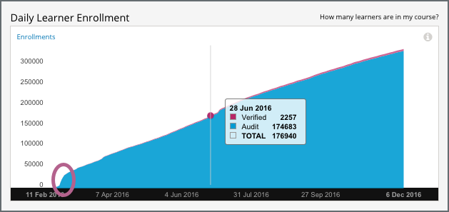
A couple of examples of this chart follow for different courses. In the first example, for a MOOC, you see enrollment climb fairly steadily over a period of several months. The markers begin with four enrollments (almost certainly the course creator and other course team members) on the day the course was created in Studio.

The chart reveals different time periods when the rate of new enrollments increased rapidly, or “spiked” (circled). The team for this course might have the contextual knowledge to correlate those periods with marketing efforts or automated enrollment events, or might want to research possible explanations. After the first spike, which coincided with the course start date on 15 April, enrollment continued to increase and an additional spike occurred over a month later.
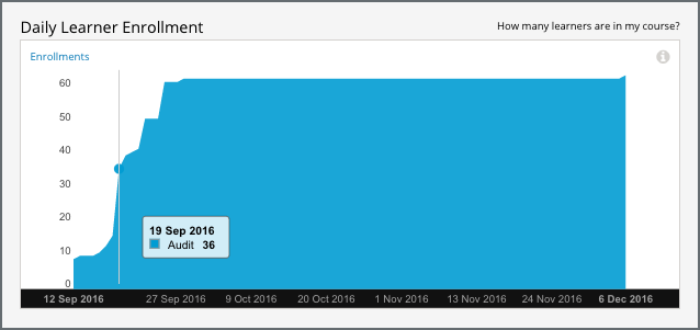
The second example shows the Daily Learner Enrollment chart for a small, private online course. In this course, the course team used the instructor dashboard in the LMS to enroll almost all of the learners in just a few days.

See the Computation Reference for a detailed description of how enrollment values are determined.
4.1.1.2. Total Enrollment Metric#
This count reports the number of learners who have ever enrolled in the course.
4.1.1.3. Current Enrollment Metric#
This count reports the number of learners who have enrolled in the course, less any learners who have unenrolled.
4.1.1.4. Change in Last Week Metric#
This metric reports the difference between the current enrollment count at the end of the day yesterday and at the end of the day one week ago.
4.1.1.5. Verified Enrollment Metric#
This count reports the number of currently enrolled learners who have elected to pursue a verified certificate for the course.
4.1.1.6. Enrollment Over Time Report#
The daily count of current enrollments, through the date of the last update, is available for review or download. Columns show each Date and its Current Enrollment.
The report includes an additional column for each of the certification options or enrollment tracks that are offered by the course, such as Verified and Audit or Professional and Audit.
To download the Enrollment Over Time report in a comma-separated value file, select Download CSV. The CSV file contains the following columns.
audit
count (current enrollment)
course_id
created (the date and time of the computation)
credit
cumulative_count (total enrollment)
date
honor
professional
verified
4.1.2. Analytics in Action: Interpreting Changes in Enrollment#
4.1.2.1. The Colbert “Bump”#
Enrollment for courses on the edX.org site opens several months before the course start date. This strategy typically results in gradually increasing enrollments over time, as site visitors find a course, sign up for it, and tell their colleagues, friends, and family about it. This strategy also gives teams the opportunity to watch for larger changes in enrollment, the temporary “spikes” that can occur after particular events, such as marketing campaigns for the course or for edX in general.
Such events can be expected or unexpected: teams for all edX courses saw a large jump in the number of enrollments in the summer of 2013, in the days after edX CEO Anant Agarwal was interviewed on the July 24 edition of The Colbert Report, a satirical late-night comedy show hosted by Stephen Colbert.
4.1.2.2. Latecomers Welcome#
After their course started, a team expected that enrollment would level off and then begin a gradual decline. While they did see an overall decline in the number of enrollments, they also noticed that occasional small spikes in enrollment continued to occur, even several weeks into the course. To give these recently-enrolled learners time to catch up, the team chose to adjust the course to be more self-paced. They shifted due dates in unreleased units later, and extended the end date to keep course content open longer.
