8.1. Working with Text Components#
This section describes how to work with Text components in Studio.
8.1.1. Text Component Overview#
HTML, or HyperText Markup Language, is the standard markup language used to create web pages. Web browsers present HTML code in a more readable format.
When students see text and images in your course, they are seeing HTML code that is formatted and presented by their browsers. For more information about HTML, see Wikipedia.
8.1.1.1. Text Components#
Text components are the basic building blocks of your course content. You use Text components to add and format text, links, images, and more. You can work with your Text components in a “visual” or WYSIWYG editor that hides the HTML code details, or in a “raw” editor that requires you to mark up your content.
Note
Review Developing Your Course and Use Best Practices for HTML Markup before you start working with Text components.
8.1.2. Options for Editing Text Components#
You can use two different editing interfaces to work with a Text component.
-
With the visual editor you create, edit, and format content in a word processing-like interface, without using HTML markup directly. With the visual editor, you can more easily format your content, and add links and images.
The visual editor includes an HTML option for you to review the HTML markup and make small formatting changes to your content. However, this HTML option does not provide the detailed control you can get with the raw HTML editor, nor does it support custom formatting or scripts.
If you add a Text component and select Text, when you select Edit the visual editor opens by default.
-
If you prefer to mark up your content directly with HTML markup, you can use the raw HTML editor. If you need to include custom formatting or scripts in your content, you must use the raw HTML editor.
If you add a Text component and select Raw HTML, when you select Edit the raw HTML editor opens by default.
There is no way to switch between the Visual Editor and the Raw HTML editor once one is selected.
Note
If you copy text from another source and paste it into either the visual or raw HTML editor, be sure to proofread the result carefully. Some applications automatically change quotation marks and apostrophes from the “straight” version to the “smart” or “curly” version. Both editors require “straight” quotation marks and apostrophes.
8.1.2.1. The Visual Editor#
The visual editor provides a “what you see is what you get” (WYSIWYG) interface that allows you to format text by selecting options at the top of the editor.
The following image shows callouts for the editing options and is followed by descriptions.
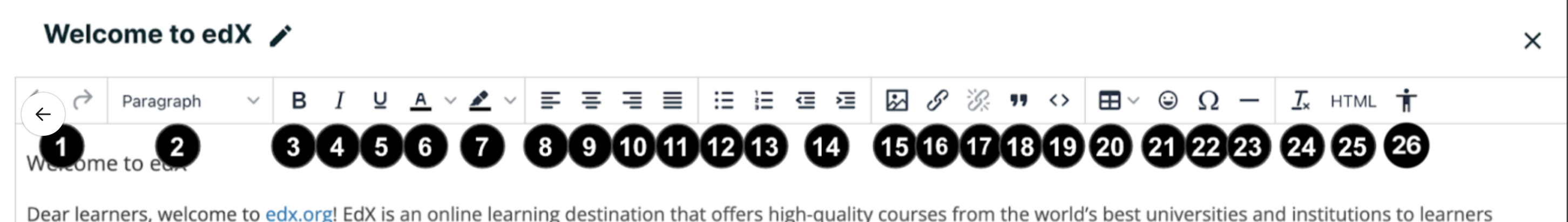
Arrows that perform undo/redo actions.
Select a formatting style for the selected text, such as paragraph,
preformatted(monospace), or a heading level.Note
The available heading levels in the Text component editor begin with heading 2 (
<h2>). Text components are part of a complete page, and elements outside the Text component use heading level 1 by default. Because tools such as screen readers use heading levels to navigate through pages, using heading level 1 inside a Text component can interfere with the functionality of these tools.Format the selected text in bold, or remove this formatting. The editor inserts
<strong>tags around the selected text.Format the selected text in italics, or remove this formatting. The editor inserts
<em>tags around the selected text.Underline the selected text, or remove this formatting. The editor encloses the selected text in the tag
<span style="text-decoration: underline;">.Change the color of the selected text. The editor encloses the selected text in the tag
<span style="color: color-hex-code;">.Change the background color of the selected text. The editor encloses the selected text in the tag
<span style="background-color: color-hex-code;">.Align text and images to the left. The editor adds
style="text-align:
left;"
to the<p>tags that surround the text.Center text and images. The editor adds
style="text-align: center;"to the<p>tags that surround the text.Align text and images to the right. The editor adds
style="text-align:
right;"
to the<p>tags that surround the text.Justify text and images. The editor adds
style="text-align: justify;"to the<p>tags that surround the text.Create a bulleted list, or remove this formatting. The editor inserts
<ul>tags around the selected text, and encloses each paragraph in<li>tags.Create a numbered list, or remove this formatting. The editor inserts
<ol>tags around the selected text, and encloses each paragraph in<li>tags.Decrease and increase the indentation of the selected paragraph.
Insert an image at the cursor. For more information, see Add an Image to a Text Component.
Create a hypertext link from the selected text. For more information, see Add a Link in a Text Component.
Remove a hypertext link from the selected text.
Format the selected paragraph as a blockquote. The editor inserts
<blockquote>tags around the selected text, which is then displayed as a separate indented paragraph.Format the selected text as a code block, or remove this formatting. The editor inserts
<code>tags around the selected text, which is then displayed in a monospace font.The table toolbar icon lets you drop in a table component and selecting a given cell lets you create, remove, or adjust rows and columns.
You can easily add emoticons to your text content. This can be a way to break up long stretches of content.
We have introduced a way to to include special characters into your text content, including mathematical and symbolic elements.
Inject a horizontal line in the highlighted content.
Clear formatting button which removes all font formatting from the selected text. This does not remove paragraph formatting (e.g. blockquote).
Review the HTML markup.
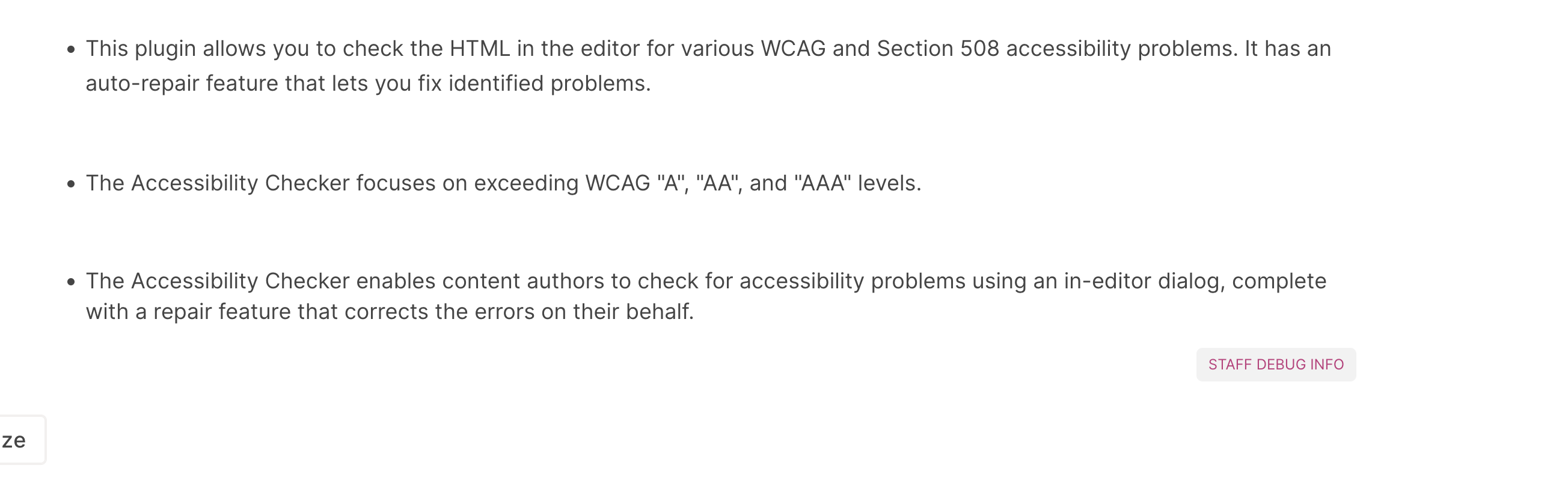
Accessibility Checker, which allows you to check HTML in the editor for various accessibility problems. For more information, see Accessibility Checker.
Note
The visual editor is not available for course handouts.
8.1.2.1.1. Review HTML Markup in the Visual Editor#
To review the HTML markup added to content in the visual editor, select HTML from the visual editor’s toolbar. The HTML source code editor opens.
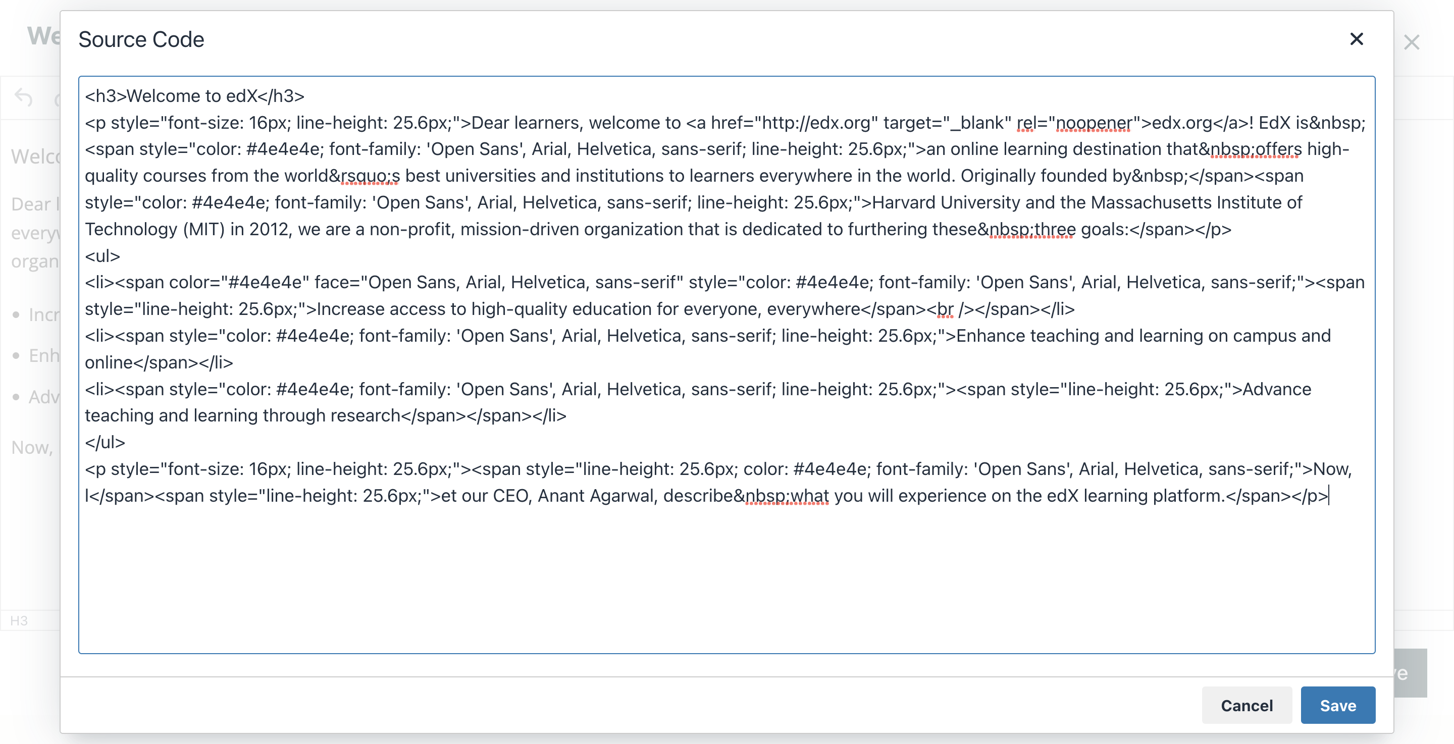
You can edit text and the HTML markup in this editor. However, you cannot add custom styles or scripts in this editor. To do this, you must use the raw HTML editor instead.
Select Save to return to the visual editor. The visual editor attempts to correct any problems with the markup that you entered. For example, if you do not provide a close paragraph tag, the editor adds the tag for you.
You can then continue working in the visual editor.
Warning
Selecting OK in the source code editor does not save your changes to the Text component. To save your changes and close the component, select Save in the visual editor. If you select Cancel, the changes you made in the HTML source code editor are discarded.
8.1.2.2. The Raw HTML Editor#
The raw HTML editor is a text editor. It does not offer a toolbar with formatting options.
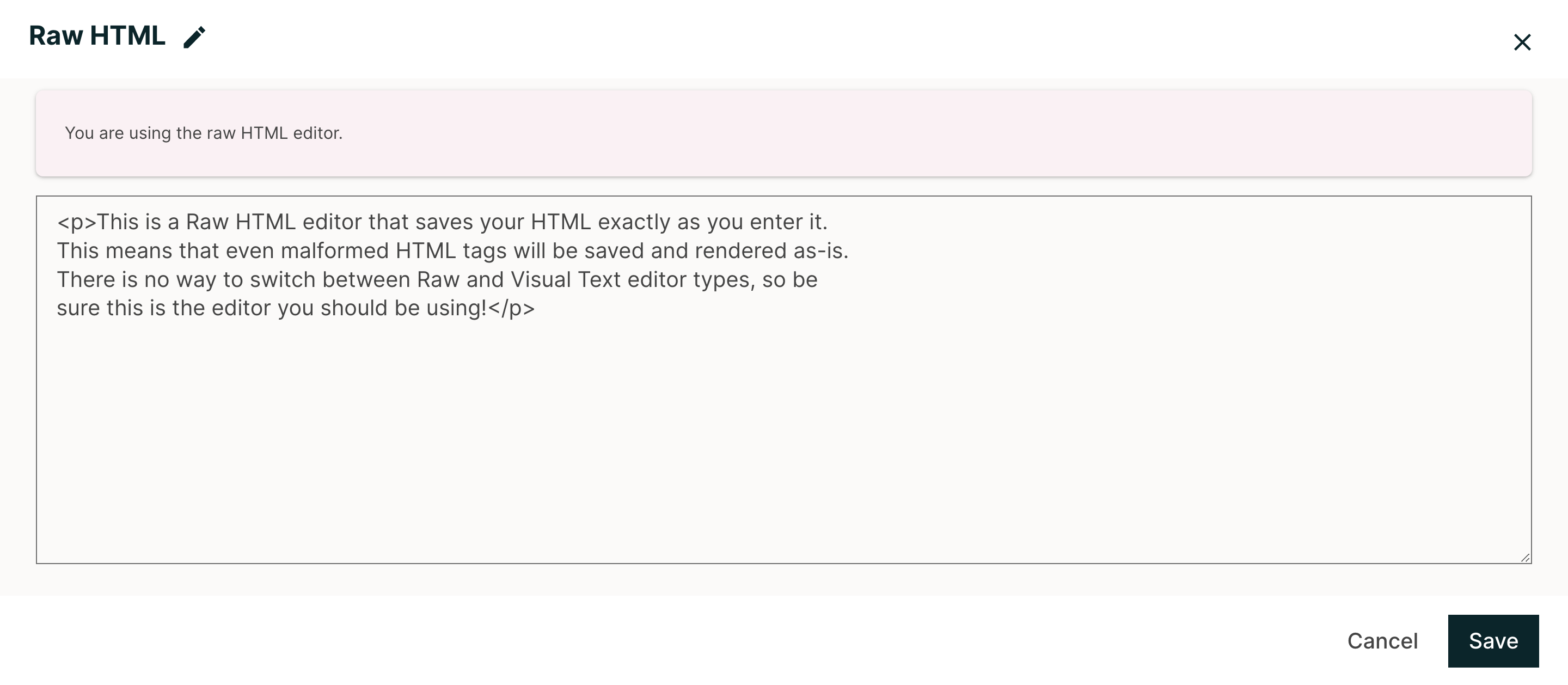
When you use this editor, you must supply valid HTML. The raw HTML editor does not validate your HTML code. If you use this editor, you should thoroughly test the HTML content in your course.
Important
When you add a heading to a Text component, make sure that you use only
heading level 2 <h2> through heading level 6 <h6>. Text components are
part of a complete page, and elements outside the Text component use heading
level 1 by default. Because tools such as screen readers use heading
levels to navigate through pages, using heading level 1 inside a Text
component can interfere with the functionality of these tools.
8.1.3. Create a Text Component#
Under Add New Component, select Text.
Select the template.
The rest of these instructions assume that you selected Text, which creates an empty Text component with the visual editor selected.
An empty Text component appears at the bottom of the unit, and the Text component opens in the visual editor.
Enter and format your content. You can review the HTML markup.
To enter a display name for the component, select the Pencil icon next to the title in the top left corner of the visual editor. Changing the display name from it’s default value to a unique, descriptive display name can help you and your learners identify course content quickly and accurately. If no title is present, the platform shows “Text” as the name of the component when in Studio.
Select Save.
When you use the visual editor, you can also perform the following tasks.
8.1.3.1. Text Component Templates#
When you create a Text component, you select from a list of templates and editor types, inlcuding the following:
Text
Announcement
IFrame Tool
Raw HTML
The Text template loads the Visual Editor with no pre-canned text.
The Announcement and the IFrame Tool templates load the Visual Editor with pre-canned text that instructs the user how to format Announcements, or how to use IFrames.
The Raw HTML editor type uses the raw HTML editor by default. All other options use the visual editor by default. There is no way to switch between Visual and Raw editor types once selected.
8.1.4. Add a Link in a Text Component#
When you use the visual editor, to add a link to a website, course unit, or file in a Text component, you work with the Insert link dialog box.
For more information, see the following tasks.
8.1.4.1. Add a Link to a Website#
Select the text that you want to use as the link text.
Select the link icon in the toolbar.
In the Insert/Edit link dialog box, enter the URL of the website that is the destination for your link in the URL field.
If you want the link to open in a new window, select the dropdown arrow next to the Open Link In… field, and then select New Window. If not, you can leave the default value.
Select OK.
Save the Text component.
To test the link, select View Live Version or Preview. When the unit opens in the LMS, select the linked text and verify that the correct website opens.
8.1.4.2. Add a Link to a Course Unit#
Note
When you create a link to another component, the unit of that destination component must be published for the link to work.
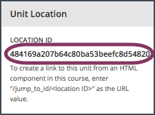
Obtain the location ID of the unit you want to link to.
In Studio, open the page for the unit that you want to link to in Studio, and then locate Unit Location in the right pane.
Under Unit Location, select and copy the alphanumeric text in the Location ID field.
Open the Text component where you want to add the link.
Select the text that you want to make into the link.
Select the link icon in the toolbar.
In the Insert link dialog box, enter a value that resembles the following value in the URL field.
/jump_to_id/<location ID>Make sure to replace <location ID> (including the brackets) with the location ID that you copied in step 1, and make sure that you include both forward slashes (/).
Caution
Ensure you use
/jump_to_id/<location ID>as the URL value. Do not use the URL of the unit that you see in the browser address bar. If you do not use/jump_to_id/<location ID>, the link will be broken if you export and then import the course.
If you want the link to open in a new window, select the dropdown arrow next to the Open Link In… field, and then select New Window. If not, you can leave the default value.
Select Insert.
Save the Text component and test the link.
8.1.4.3. Add a Link to a File#
Tip
When you add links to files, open the Text component and the Files & Uploads page in separate browser windows. You can then more quickly copy file URLs.
You can add a link in a Text component to any file that is uploaded for the course. For more information about uploading files, see Adding Files to a Course.
Note
Do not use this method to add images to Text components. Instead, use the method in Add an Image to a Text Component.
On the Files & Uploads page, locate the file that you want, and then select Studio in the Copy URLs column.
Note
You must use the Studio URL to link to the file, not the Web URL. For more information, see Adding Files to a Course.
In the Text component where you want to add the link, select the text that you want to make into the link.
In the toolbar, select the link icon.
In the Insert link dialog box, paste the Studio URL for the file in the URL field. For example, the URL might resemble the following URL.
/static/FileName.pdfMake sure that you include both forward slashes (/).
(optional) If you want the link to open in a new window, select the dropdown arrow next to the Open Link In… field, and then select New Window. If not, you can leave the default value.
Select OK.
Save the Text component and test the link.
8.1.5. Add an Image to a Text Component#
When you use the Visual Editor, you can add any image from your computer to a Text component. You can see a preview of the image before you add it to the component.
Note
Before you add an image, make sure that you obtain copyright permissions for images you use in your course, and that you cite sources appropriately.
To add effective alternative text for images, review Use Best Practices for Describing Images.
You can only add one image at one time.
Each individual image file must be smaller than 10 MB.
To add an image to a Text component, you can use one of the following procedures.
Locate an image by using the Browse Your Computer option in the Add Image dialog box.
Select an image that you have previously uploaded.
8.1.5.1. Locate an Image on Your Computer#
In the Text component, position the cursor where you want to add an image, and then select the image icon on the toolbar.
In the Add an Image dialog box, Upload a New Image (10 MB max).
In the dialog box that opens, locate the file that you want to add, and then select Open, or locate the image in the Image Gallery, and then select Next.
As soon as your image is selected, the Image Settings dialog box opens.
In the Edit Image Settings dialog box, add an image description.
In the Alt Text field, enter alternative text for the image. This text becomes the value of the
altattribute in HTML and is required for your course to be fully accessible. For more information, see Use Best Practices for Describing Images.If your image is a decorative image that does not convey important information, select the This image is decorative (no alt text required) checkbox.
(optional) Specify the width and height of your image. For more information, see Change the Image Size.
Select Save.
Save the Text component and test the image.
8.1.5.2. Select a Previously Uploaded Image#
When you upload an image, the image automatically becomes available in a gallery list that opens when you add an image to a Text component.
In the Text component, position the cursor where you want to add an image, and then select the image icon on the toolbar.
In the Add an Image dialog box, locate the image in the gallery list, and then select Next. There are sort and filter options available for the gallery list to make it easy to find the image you need.
In the Image Settings dialog box, complete one of the following options.
In the Alt Text field, enter alternative text for the image. This text becomes the value of the
altattribute in HTML and is required for your course to be fully accessible. For more information, see Use Best Practices for Describing Images.If your image is a decorative image that does not convey important information, select the This image is decorative (no alt text required) checkbox.
(optional) Specify the width and height of your image. For more information, see Change the Image Size.
Select Save.
Save the Text component and test the image.
8.1.5.3. Format an Image in a Text Component#
You have several options for formatting an image in a Text component.
8.1.5.3.1. Align an Image#
To align your image to the right, the left, or the center, follow these steps.
In the Text component, select the image.
On the toolbar, select the left align, right align, or center icon.
8.1.5.3.2. Change the Image Size#
To change the size of your image, follow these steps.
In the Text component, select the image that you want to edit, and then select the Contextual image icon that appears above the image.
In the Image Settings dialog box, locate Image Dimensions, and then enter the values that you want for the Width and Height options.
Note
To make sure that the image keeps the same proportions when you change the image size, make sure that Lock proportions is selected, and enter a number in only the Width field or the Height field. After you tab or click outside that field, the number in the other field changes to a value that maintains the image proportions.
Select Save.
If you want to change the image back to the original size, clear the values in the Width and Height fields.
8.1.6. Power Paste#
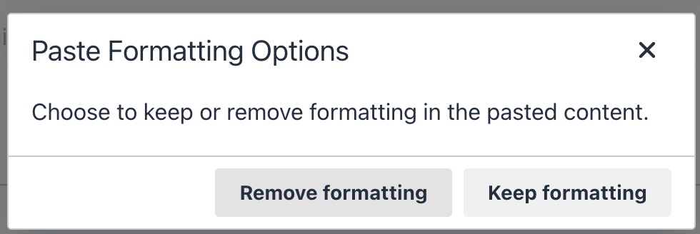
Many course authoring teams rely on copying and pasting content from documents such as Google docs or Microsoft Word. Correct formatting in Studio and the LMS can be most easily realized through Power Paste.
When you copy and paste content into the Text Editor, you will receive a “Paste Formatting Options” popup on the page. If you choose “Remove formatting”, then the bullets will be correctly aligned with text in both Studio and the LMS. If you select “Keep formatting”, then the formatting is unchanged and bullets and text will not be aligned in Studio or the LMS.
Below is a bulleted list example, a type of formatting that commonly needs Power Paste. If you select “Keep formatting”, this is what Studio and LMS will show:
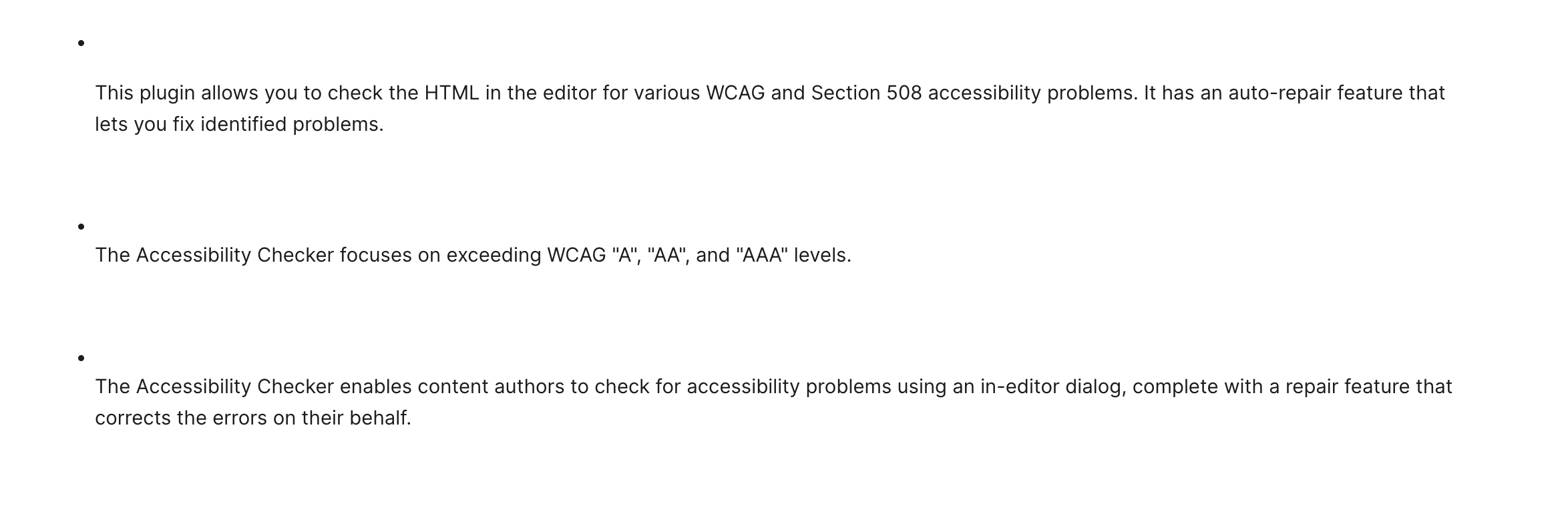
However, if you select “Remove formatting”, this is what Studio and LMS will show: