6.6. Developing Course Components
This chapter describes how you develop course components. See:
- What is a Component
- Add a Component
- Edit a Component
- Duplicate a Component
- Delete a Component
- Components that Contain Other Components
For more information about specific component types, see:
6.6.1. What is a Component?
A component is the part of a unit that contains your actual course content. A unit can contain one or more components.
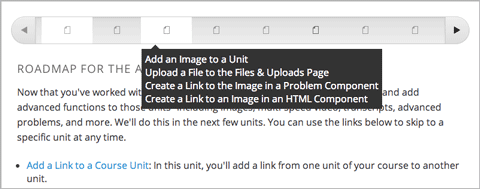
A student can view the name of all components in a unit by hovering over the unit in the ribbon at the top of the page.
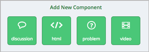
By default, Studio includes four types of components.
- Discussion components provide discussion spaces in the body of your course. Students can explore ideas about a lesson with their peers in a discussion space.
- HTML components allow you to add text, images, and some types of learning tools to your course. Content in HTML components is formatted as HTML.
- Problem components enable you to add many different types of exercises and problems to you course, from simple multiple choice problems to complex circuit schematic exercises.
- Video components contain the videos that you want to include in your course.
6.6.2. Add a Component
To add a component to the unit, click the component type that you want under Add New Component.
For more information, see the documentation for the specific component type that you want:
- Working with Discussion Components
- Working with HTML Components
- Working with Problem Components
- Working with Video Components
After you add a component, it is not visible to students until you publish the unit.
6.6.3. Edit a Component
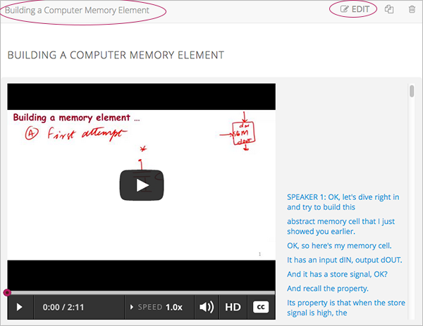
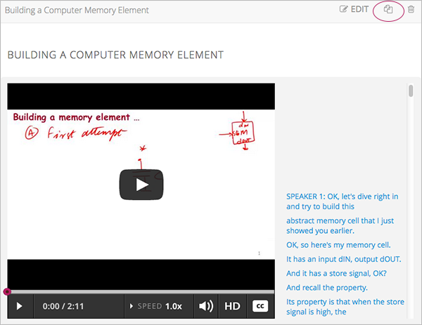
To edit a component, click Edit:
Then follow instructions for the type of component you are editing.
After you edit a component, the changes are not visible to students until you publish the unit.
6.6.3.1. Set the Display Name for a Component
Each component has a display name that shows in the component header when you can edit the component. The display name also shows to students when they hover the cursor over the unit icon in the course ribbon.
To set the display name for a component:
- Edit the component.
- Click Settings.
- Edit the Display Name field.
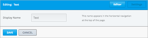
- Click Save.
Different types of components have different fields in the Settings dialog box, but all have the Display Name field.
6.6.4. Duplicate a Component
When you duplicate a component, a new copy of that component is added directly beneath the first component. You can then modify the duplicate. In many cases, duplicating a component and editing a copy is a faster way to create new content.
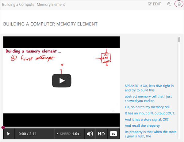
To duplicate a component, click the Duplicate icon in the component header:
Then follow instructions for the type of component you are editing.
After you duplicate a component, the new component is not visible to students until you publish the unit.
Note
You cannot duplicate a content experiment.
6.6.5. Delete a Component
Caution
Be sure you want to delete the component. You can not undo the deletion.
To delete a component:
- Click the Delete icon in the component header:
- When you receive the confirmation prompt, click Yes, delete this component.
After you delete a component, the component remians visible to students until you publish the unit.
6.6.6. Components that Contain Other Components
For specific use cases, you configure course content so that components contain other components. For example, if you want to include conditional components or content experiments, you have to create components inside components. See Creating Content Experiments for more information.
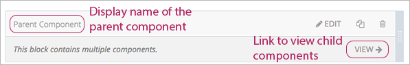
The component that contains other components is referred to as the parent; the contained components are referred to as children.
In the unit page, a parent component appears with the display name and a View link. For example:
6.6.6.1. Edit a Parent Component
A parent component does not directly contain content. Content such as HTML, videos, or problems are in the child components.
A parent component has a display name. When the unit is private or in draft, click Edit in the parent component to change the display name.
Note
Parent components of a specific type, such as content experiments, have additional attributes that you edit.
6.6.6.2. View Child Components
When you click View in the parent component, the parent component page opens, showing all child components. In this example, Child Component A contains an HTML component and a video:
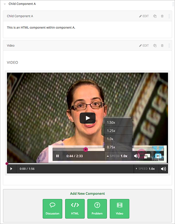
Click the arrow next to a child component name to collapse it and hide the component’s contents:
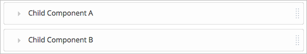
Click the arrow again to expand the component.
See:
6.6.6.3. Add a Child Component
If the containing unit is private or in draft, you can add a child component in its parent component.
To add a child component, open and expand the parent component. Then click the component type that you want under Add New Component within the parent component.
For more information, see the documentation for the specific component type that you want:
6.6.6.4. XML for Parent and Child Components
You develop parent and child components in XML, then import the XML course into Studio to verify that the structure is as you intended.
For more information about working with your course’s XML files, including information about terminology, see the edX XML Tutorial.
The following examples show the XML used to create the unit and components shown in Studio above.
The XML for the unit is:
<vertical display_name="Unit 1">
    <html url_name="6a5cf0ea41a54b209e0815147896d1b2"/>
    <vertical url_name="131a499ddaa3474194c1aa2eced34455"/>
</vertical>
The <vertical url_name="131a499ddaa3474194c1aa2eced34455"/> element above
references the parent component file that contains the child components:
<vertical display_name="Parent Component">
    <vertical url_name="2758bbc495dd40d59050da15b40bd9a5"/>
    <vertical url_name="c5c8b27c2c5546e784432f3b2b6cf2ea"/>
</vertical>
The two verticals referenced by the parent component refer to the child components, which contain the actual content of your course:
<vertical display_name="Child Component A">
    <html url_name="4471618afafb45bfb86cbe511973e225"/>
    <video url_name="fbd800d0bdbd4cb69ac70c47c9f699e1"/>
</vertical>
<vertical display_name="Child Component B">
    <html url_name="dd6ef295fda74a639842e1a49c66b2c7"/>
    <problem url_name="b40ecbe4ed1b4280ae93e2a158edae6f"/>
</vertical>
Theoretically, there is no limit to the levels of component nesting you can use in your course.
6.6.6.5. The Student View of Nested Components
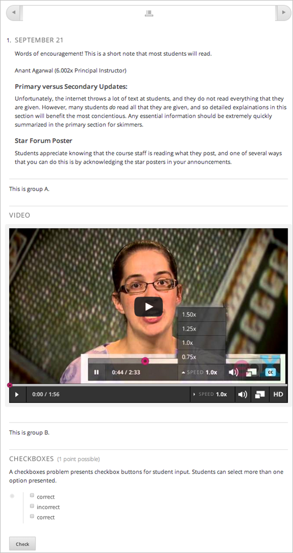
For students, all parent and child components are displayed on the unit page. The following example shows the student view of the unit described above:
Note
The visibility of nested components depends on the visibility of the parent unit. The parent unit must be public for students to see nested components. For more information, see Unit Publishing Status and Visibility to Students.
6.6.7. Reorganizing Child Components
You can reorganize child components through the same drag and drop process you use for other objects in your course outline. You hover over the element handle on the right side of the screen until the mouse pointer changes to a four- headed arrow. Then, click and drag the element to the location that you want.
Furthermore, when you have multiple levels of nesting, you can drag a child component into a different parent component, if both parents are expanded. For example, you can select the video component that is in Child Component A and drag it into Child Component B. Select the video component, and as you drag it into Child Component B, release the mouse button when a dashed outline of the component you are moving appears in the new location:
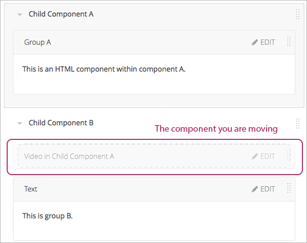
You can also drag a child component outside of a parent, so that the child moves to the same level as the parent.
Note
For content experiments, you cannot drag a child component outside of a test group.